SMAD 203 FINAL WEBSITE DIFFERENCES

Before

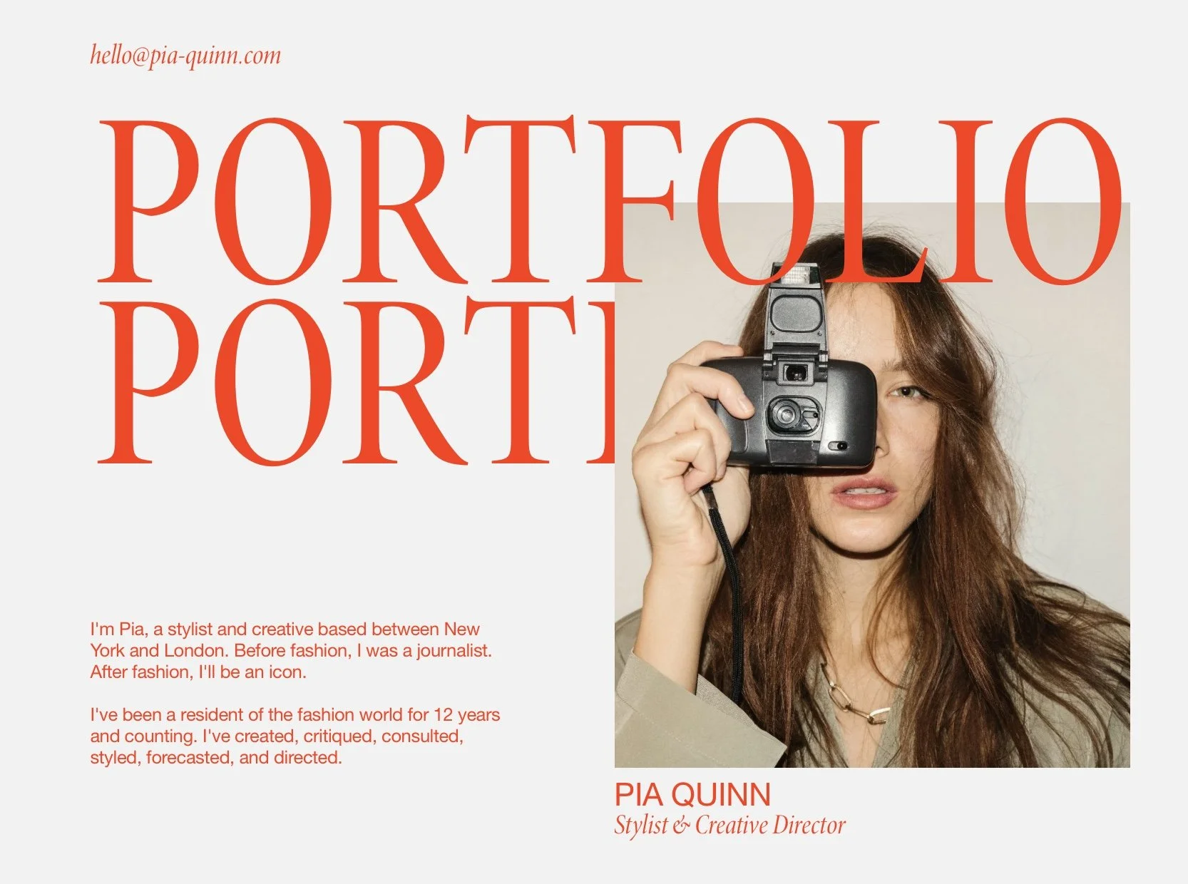
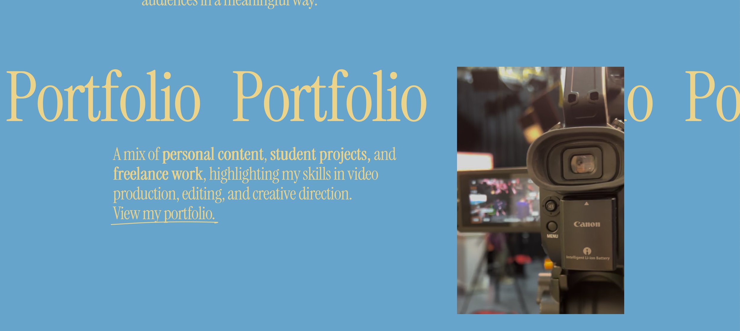
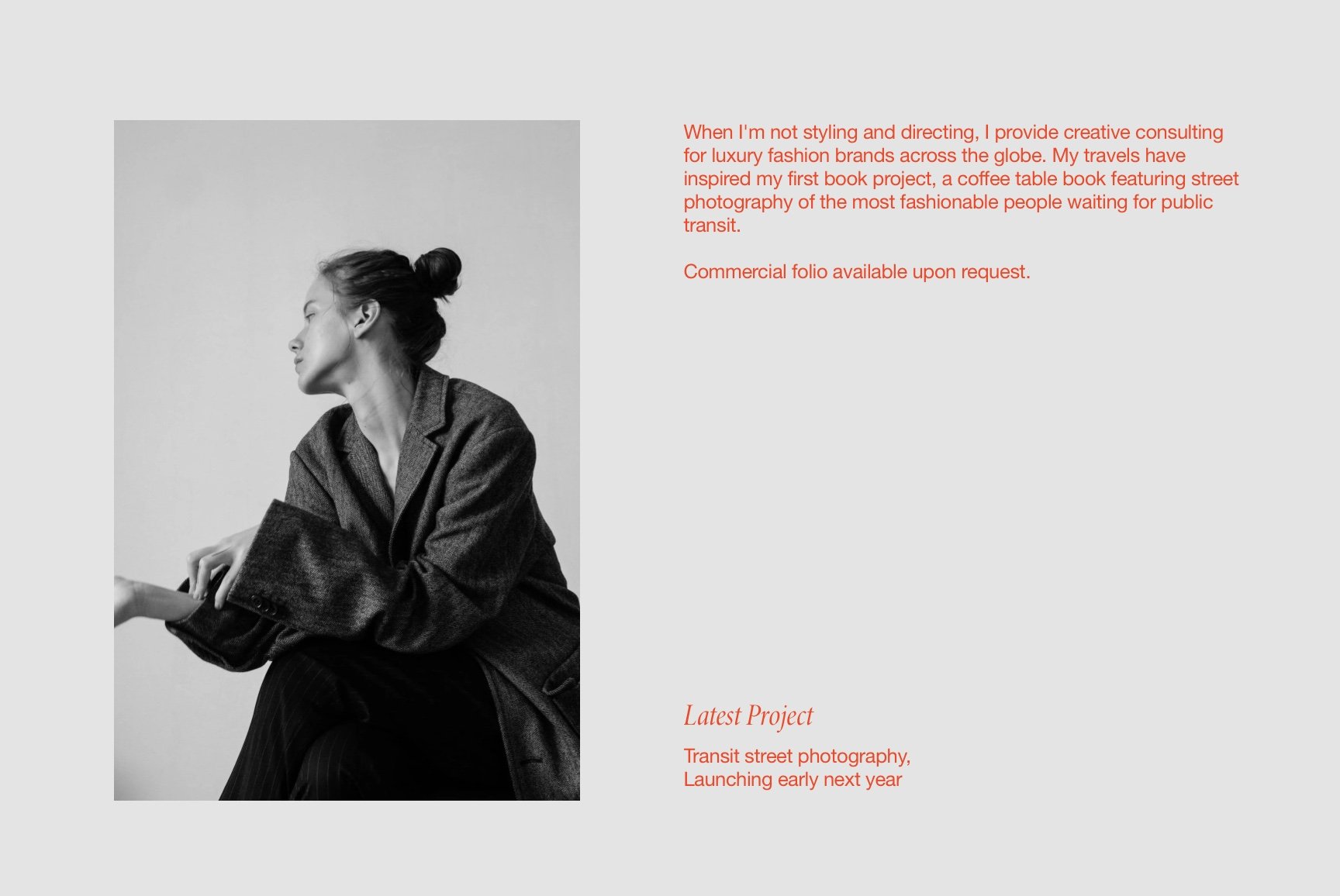
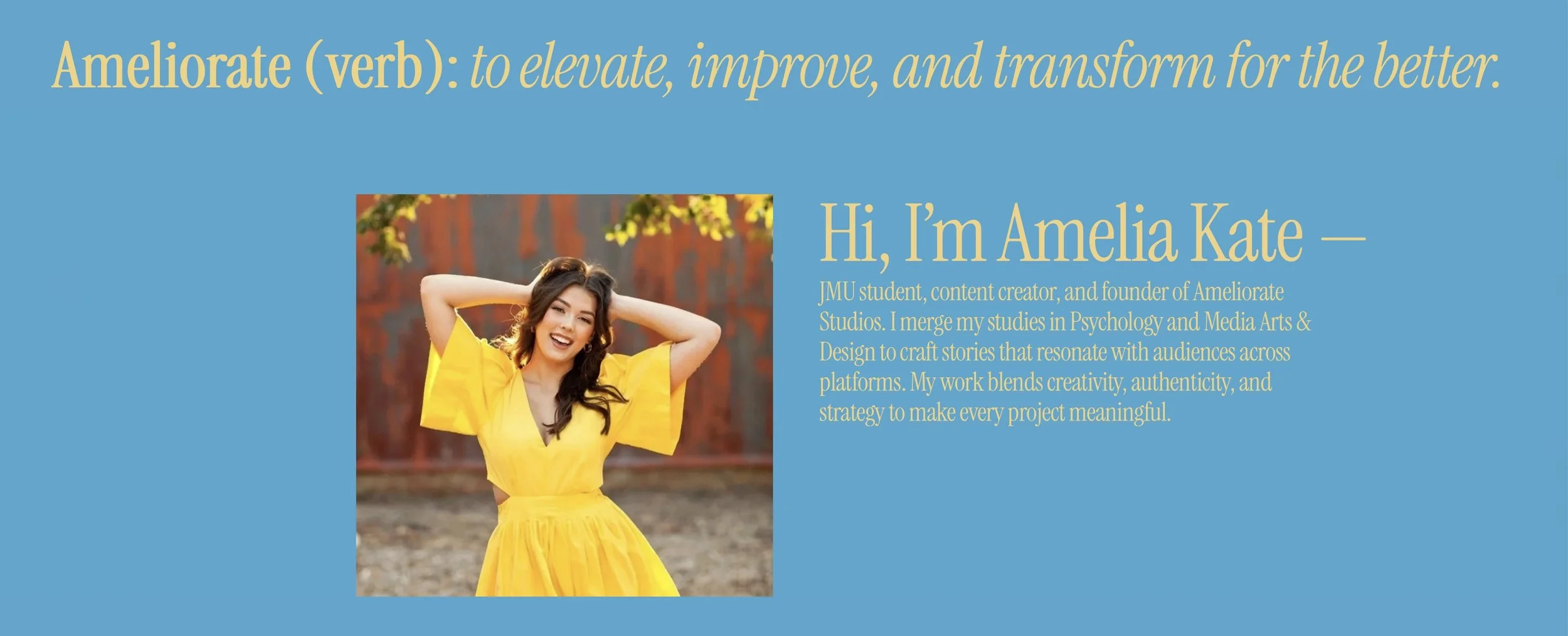
I used this template because I loved how clean, modern, and editorial it felt. The layout is super visual, which is perfect for the kind of creative projects I want to showcase, and I liked how easy it was to organize everything into sections like Select Works and Info. It keeps things minimal and easy to navigate, but still feels elevated and professional, which matches the direction I’m trying to go in with my portfolio.

Read more about why I chose this theme!

After

I used the original portfolio as a guide, but I changed the photo to a picture of a camera to show that my work is in media production. I changed the titles to be scrolling, and layered it behind the photo. I changed the fonts, and changed the colors to mach the Ameliorate Studios brand.

Before

This section of the template caught my eye because of its simplicity. I love the idea of having an “about” section so that employers and potential clients can put a face to the name.

After

I added an eye-catching title to this section, keeping the “about” blurb. I added a photo of myself, resembling the original theme, ensuring that the photos complement my brand colors.

PLEASE NOTE: This is an introductory UX assignment created for SMAD 203 and does not represent my full professional skillset.
Intended for academic review by professor only.
Return to full portfolio here.