
SMAD 203 THEME RESEARCH
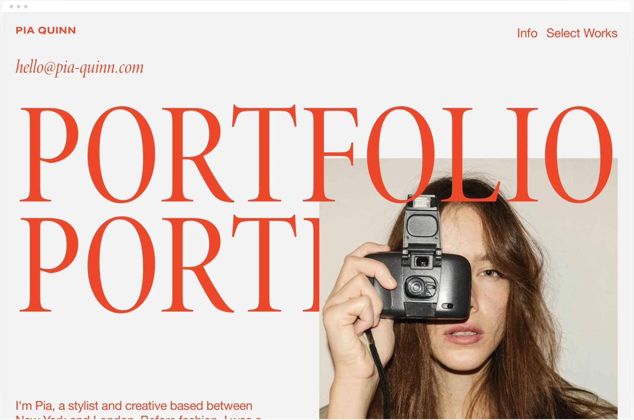
This theme is bright, eye-catching, and has space for me to showcase lots of aspects of my creative work. It is mostly focused on magazines, editorial styling, and photography, so I would have to edit it to fit my own work. I am worried that the “select works” page isn’t set up to showcase UX work. The scrolling animation may confuse users, especially with the wide array of creative work I have to show.
This theme is a simple, user-friendly portfolio. I like how each photo brings users to a new page where they can read more about each project. I am worried about how I am going to organize the range of work I have (short-films, social media campaigns, UX projects, etc.). I don’t think it’s fit to showcase all of those projects. I also don’t need a “blog” section, so I would have to edit that out or transform it into a more usable page. Overall, it’s a good theme, but doesn’t work for my projects.
This theme is simple while still having plenty of information on the home page. There is no scrolling animation, allowing users to focus on the content rather than its presentation. I like that it’s designed specifically for UX and UI design and strategy, which is perfect for this assignment. I think the project display could be a little more intuitive. The arrows are small and transparent, and I didn’t know there were more projects to be seen. I also wish users could click on the photos and be brought to a separate “about” page.
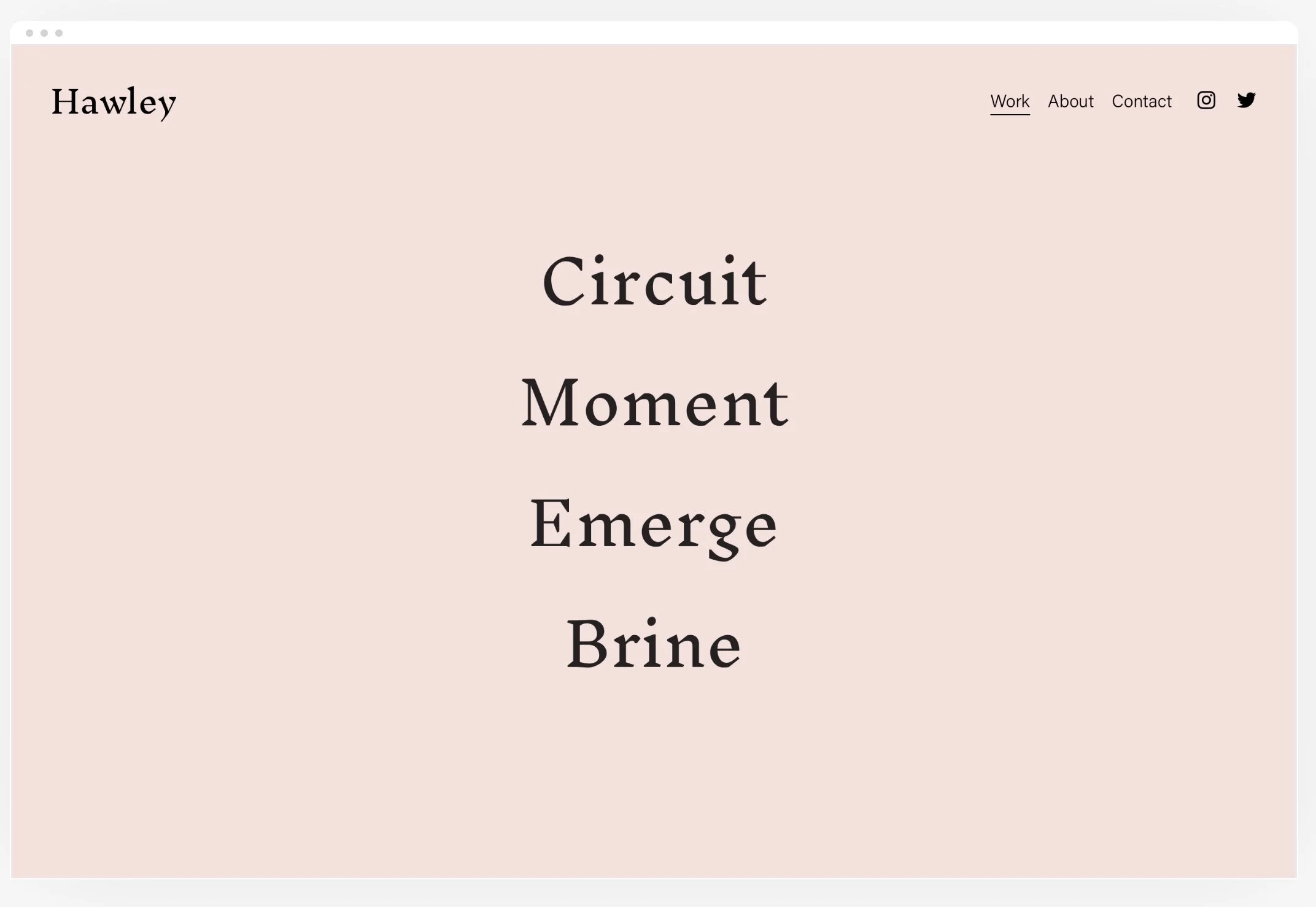
This theme has four different sections of the portfolio, which is perfect because I have many different sections of work I'd like to show. When I put my cursor over one of the titles and then bring it down over another title, it doesn’t take me to the new title. I have to bring my cursor off of the text onto the white space, and then bring it to the new title. I think it could be confusing for users trying to navigate between sections. I like how there is a separate page for About and Contact, and will definitely be using pages like that in my own design.
I love the minimalist style of this theme, and how the emphasis is really on the work. Something that worries me is that my work is very aesthetically versatile, meaning that the rotating background photos may lead to an inconsistent theme overall. I also wish I could click on each photo and learn more about each project— I think it would add to it and make it a more well-rounded site.
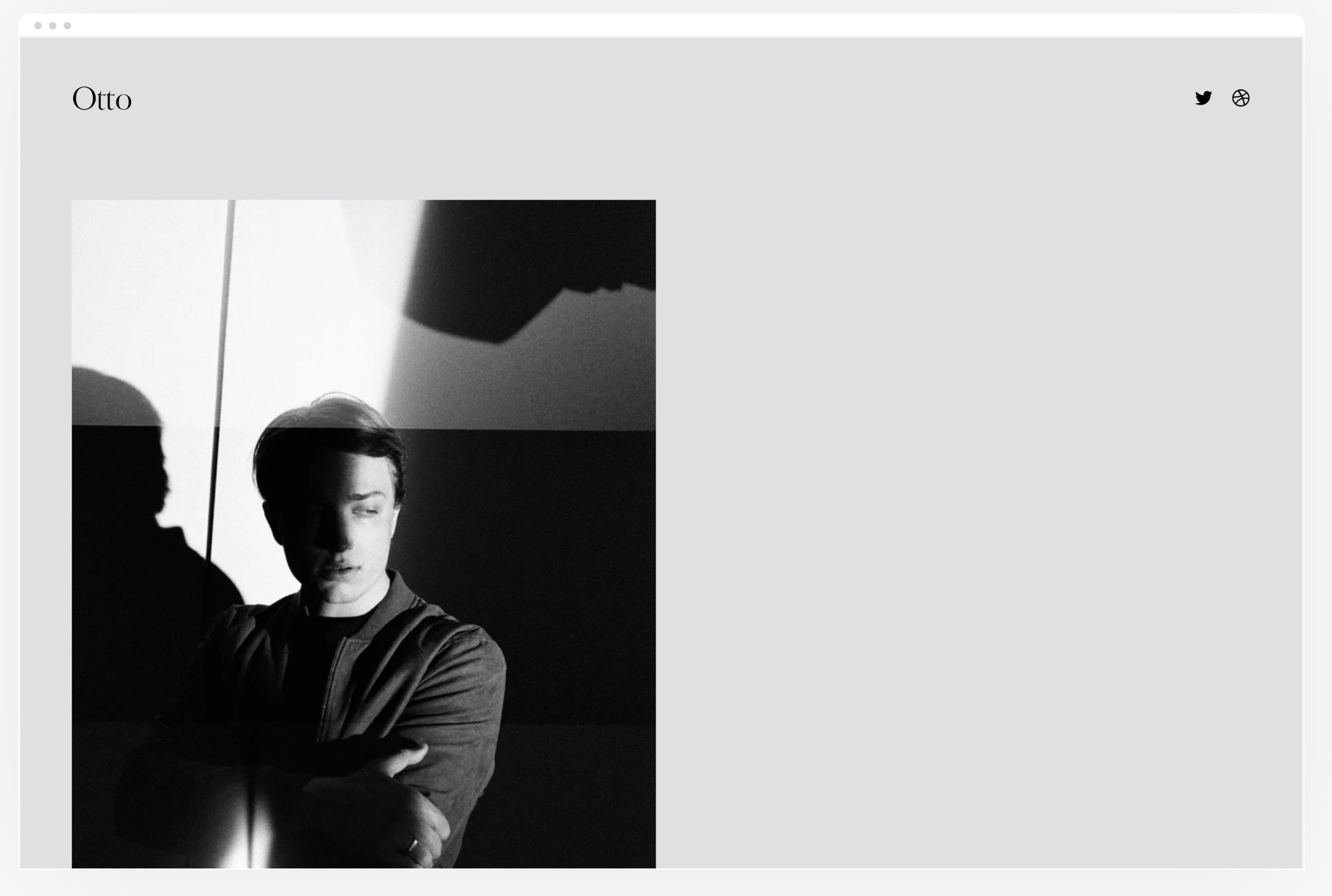
I chose Otto as my #1 theme because I loved how dynamic it was while still maintaining clarity. I thought it had the perfect balance of text and photos, with enough variability that I can include all my projects on it. I will definitely be basing my site off of this theme.
I chose Quinn as my #2 theme because I loved its boldness. The reason why it’s not my #1 is that I couldn’t tell if I liked the template, or the way the designer styled the site (colors, photos, etc.) I didn’t want it to use everything that I love the second I started editing it.
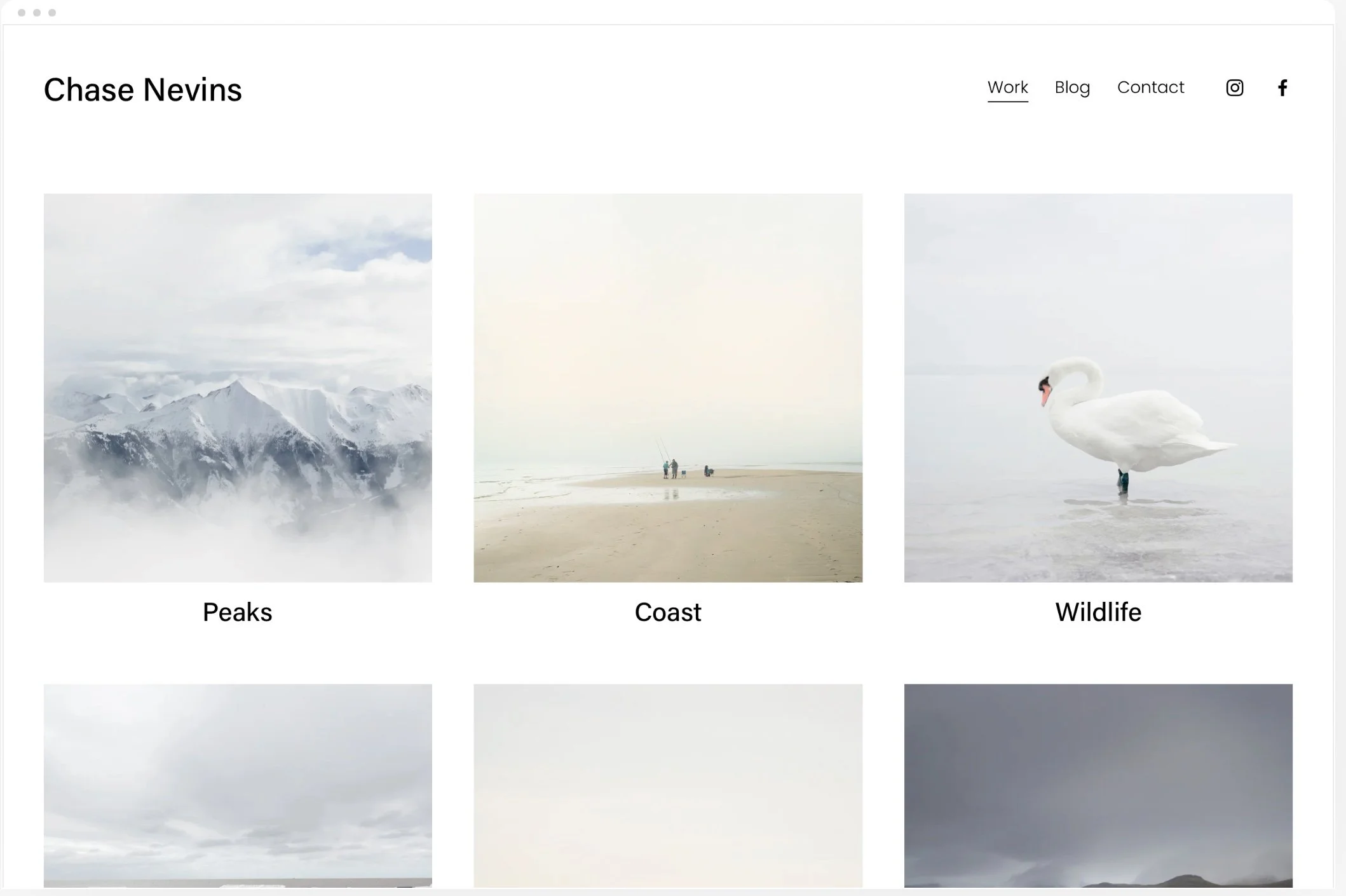
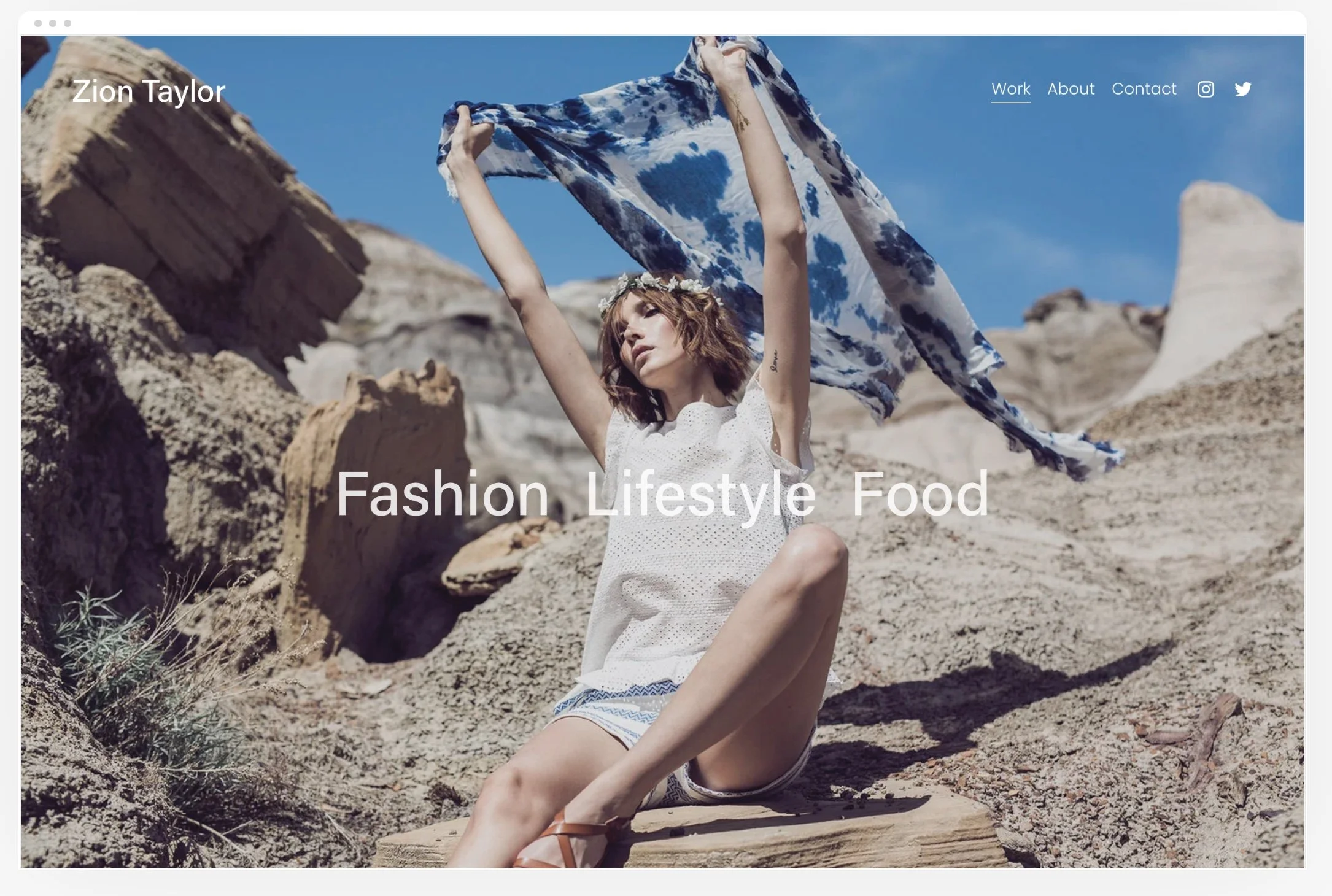
I chose Zion as my #3 because I loved how it showcased each project. The emphasis was on each project rather than the theme itself. As I mentioned before, I am worried that the wide variety of my work would throw off the aesthetics.