For this assignment, I expanded my UX work on StudyBuddy by analyzing competitors, defining the app’s information architecture, and developing a set of low-fidelity wireframes. The goal was to translate user needs and design requirements into a clear structural foundation for the app.
I conducted competitive research on three tutoring and academic-support apps, comparing their features, navigation patterns, and onboarding flows. I created a feature comparison table and collected reference screenshots to identify what worked well and where StudyBuddy could offer a stronger, more flexible experience.
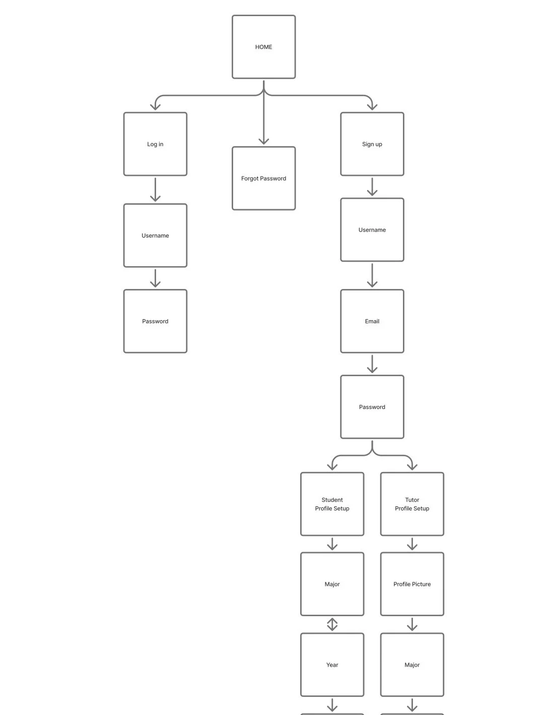
Using insights from my user stories and design requirements, I designed a sitemap that outlines StudyBuddy’s primary navigation and secondary pathways. This included key pages such as the Home Dashboard, Tutor/Student Matching, Profiles, Messaging, and Scheduling. I also incorporated metadata elements—like course tags and learning-style labels—to improve content relationships and help users find relevant matches more efficiently.
Finally, I built a set of static wireframes in Figma that visualize the core layout, hierarchy, and navigation structure of the StudyBuddy app. These wireframes intentionally avoid color and styling to focus purely on usability, content priority, and flow. They include placeholders for imagery, navigation menus, key feature buttons, and essential user pathways.
This project demonstrates my ability to combine research, structure, and UX strategy—translating user needs into an organized system that sets the foundation for a fully functional product.